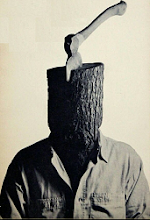
The Kirby Character Meme
Here’s the original challenge from Kleefeld:
The past few years, I've been writing a column for Jack Kirby Collector that looks at Kirby's visual design of characters. It's been infinitely fascinating for me, and I almost always find some surprises in my research on Kirby's design processes for the characters I write about.
I thought I'd bring other people into the fold by my first attempt at starting a blogosphere meme. Here's the premise:
Forget Jack's overall storytelling, forget his characterization, just look at the visual representation of his characters -- the actual drawings themselves. Now tell us what YOU think is the best character design Jack Kirby ever created and why. The challenge, it seems to me, isn't so much finding a good (or even great) character design; it's narrowing the field down to just one!
What is my favorite Kirby character design? Before I give my answer, I’ll start by saying that I love Captain America, and Kirby did a tremendous job with him. But the costume is more than a little goofy.
The basic idea is great: a modern-day knight, with chain mail, gauntlets, and a shield. The flourishes, though, are strange. Wings on the head? The striped midriff? Ah, well.

Much as I love the guy, he looks a little like a dork.
Who is Kirby’s best design?
Who else?
DOOOOOOOOOOOM!!
Doctor Doom is the counterpoint to Mr. Fantastic. He is the Dark Side of Genius. Where Richards lives in a bright white tower, open to the public, Doom lives in an ancient fortress in a police state. Richards wears a bright blue jumpsuit and creates inventions to push back the boundaries of human knowledge. Doom wears armor and a mask, and his work is purely for the Greater Glory of Dooooooom!
Richards represents intelligence for the good of all and looking to the future. He is the American Space Age. Doom represents intelligence for personal gain and anchored to the nightmares of the past. He is the Gothic Villain.
Doom’s design has a few great touches. The basic form of his costume is the armor. The armor looks medieval, hinting at Doom’s preoccupation with the occult, as well as Doom’s status as an old-tymey genius, the sort who was feared by the populace and kidnapped local maidens for purposes too horrible to contemplate. Over the armor he wears a green tunic, a little reminiscent of Greece and Rome, and a hooded cloak, which reinforces Doom’s sorcerous flavor.
The true genius of Doom’s design is in the mask. Doom’s look is, for the most part, simple: smooth armored limbs, circles at his joints and clasps, the simple green clothes, and the holster. Nothing notable. Doom’s mask is entirely different, without betraying the basic thrust of the design. It draws attention to Victor’s face though it does not disrupt the harmony of the design while doing so.
Nooks and crannies give the mask a sinister look, and draw attention to Doom’s crazy, crazy eyes. The mask’s mouth is full of techno-gadgetry, hinting that Victor’s true insides are not man, but machine. Moreover, the ugliness of the mask hints at the horrible, scarred face beneath it. Doom’s mask is as ugly and frightening as the man who wears it.
(That’s my pet theory as to why cartoon versions of Doom fail—without the details in the mask, the strengths of his design are lost.)
Kirby’s Doom was the greatest ranting, larger-than-life villain the comics have ever produced. It’s a hell of a look.
Of course it is!
For he is DOOOOOOOOOM!!
Who do I tag?
Oh, let's see if the Big Dawgs of the Blogosphere are paying attention.
Dave Campbell, paging Dave Campbell. Chris Sims, paging Chris Sims. Bully the little stuffed bull, paging Bully the little stuffed bull. Devon Sanders, paging Devon Sanders.
Kirby meme on the line.
(Devon doesn't much like Kirby, as I recall. That'll make it fun.)
posted by Harvey Jerkwater at
11/22/2006 03:19:00 PM
![]()

18 Comments:
Nice treatment, Harvey! Love the Ricards/Doom comparison. And the mask.
Departing from the purely-visual thing for a moment, though, I've got to agree with you about the way over-the-top megalomaniacal ranting that is DOOM!!!! It's just the greatest stuff ever. The guy simply cannot control himself, he's absolutely compulsive, and it's awesome.
My personal favourite: a flunky bumps into him, or something. "You fool! You'll pay for...!" Looks over shoulder at Silver Surfer. "Er...I mean, I hope you did not injure yourself, my good fellow! Ha! Ha! Yes, as you can see, my friend, Doom is a benevolent ruler..."
Just to talk that way is clearly already to be a supervillain. You wouldn't even have to do anything else.
By Anonymous, at 7:45 PM
It's true, Doom has the best Kirby costume ever. Heck probably the best VILLAIN look ever. Possibly because for once, Kirby kept it fairly simple. Darkseid is fairly low-key as well, which also works.
By SallyP, at 12:01 PM
I simply love the combination of the very old looking combined with the very futuristic function of the armour. Doom was retro before retro was a concept. Doom is the real deal.
By joncormier, at 9:37 AM
Doom rocks, but I love the design for Mr. Miracle.
By Anonymous, at 10:37 AM
This is a nice information shared here. These comic characters are good.
By cheap kamagra online, at 5:26 AM
thanks for sharing information!
By levitra online, at 6:48 AM
To bad.Anyway I want to say that the comic was awesome to read.
By cum sa faci bani pe internet Goian, at 3:28 PM
https://www.etqan-sa.com/
افضل شركة نقل عفش
شركة نقل اثاث بالرياض
شركة نقل عفش بالرياض
شركة نقل اثاث بالرياض الصفرات
شركة نقل اثاث بالرياض عماله فلبينيه
شركة نقل اثاث من الرياض إلي ينبع
موقع شركة نقل اثاث بالرياض
By مركز الاختيار للطب النفسي, at 9:15 AM
Wonderful! It's truly great and also remarkable. I think it will be good for anyone. Many thanks for sharing!
Best Regards,
image masking service
By Zack Nilsson, at 12:08 AM
memes are a popular form of internet culture that spread quickly and widely across social media platforms. The Kirby character, known for its cute and round appearance, has been featured in various memes and has become a beloved icon in the gaming community. Memes can provide a lighthearted and humorous break from the stresses of everyday life and can serve as a way for people to connect and share common experiences. As with any form of media, it's important to consider the potential impact of memes and ensure that they don't perpetuate harmful or offensive messages.
See Some our real estate retouching Picture
By Abdullah Al Noman, at 11:16 PM
This is a great meme! I completely agree with the opinion that Doctor Doom is Jack Kirby's best design. He's the ultimate villain with a memorable look that stands out from the rest. His costume is equally horrifying and awe-inspiring. I can definitely understand why many people consider him to be the most iconic villain of all time. Great choice!
Get The Best jewelry photo retouching services
By William Thomas, at 3:53 AM
Very good content, ı will wait more. thank you for your effort ı will return this page when ı try this
By 소액결제 현금화, at 6:07 AM
Amazing content, very interesting, ı will check again. Thank you for this post.
By 토토사이트, at 6:08 AM
Memes have become a powerful part of online culture, spreading rapidly across social platforms and bringing people together through humor and shared experiences. One standout figure in this space is Kirby—with its adorable, round design and charm, Kirby has captured hearts and sparked countless creative memes within the gaming world.
While memes often offer a much-needed laugh or lighthearted escape, it's always wise to stay mindful of the messages they carry. Humor should uplift, not harm.
Curious about our creative side? Take a look at some of our ghost mannequin services to see how we bring visuals to life in a whole different way.
By Clipping Path Services, at 9:51 AM
Thanks for the nice blog. It was very useful for me. I'm happy I found this blog. Thank you for sharing with us, I too always learn something new from your post.
ZMB
ZMB
By MShamsSEO, at 5:37 AM
Great dive into Kirby fan culture and Jack Kirby's visual legacy! I loved reading your top pick for the best Kirby-designed character—and especially the reasoning behind it.
By car photo editing lab, at 6:06 AM
Fun read! I like how you connected the meme idea with Kirby’s larger influence on character design. It’s a nice reminder of just how timeless and imaginative his creations still are.
By Saju Ahmed, at 6:09 AM
Thanks for sharing the “Kirby character meme” post — it’s a fun look into how fans interpret design and character archetypes, and really highlights how much there is to appreciate in comic and character art. I enjoyed seeing your picks and how you explore the visual elements of each one.
Visit Our Site:
Car Background Replacement Service
Car Background Removal Service
Automotive Photo Editing Service
Car Shadow And Reflection Service
Car Image Retouching Service
Vehicle Color Correction Service
Car Parts Photo Editing Service
Motorbike Photo Editing Service
E-Commerce Photo Editing Service
By Car Photo Editing Lab, at 9:53 AM
Post a Comment
<< Home